Tạo Form Sign In/Up Hiệu Ứng Transitions cực Cool với Css3
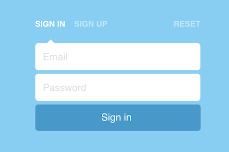
Form Sign In/Up được sử dụng hàng ngày khi chúng ta vào trang quản trị web. Tuy nhiên làm sao để tạo ra một form đơn giản, đẹp thì xem bài viết này nhé !
Hôm nay, mình sẽ chia sẻ cho các bạn một đoạn css3 có thể giúp các bạn tạo hiệu ứng transition cho form đăng nhập/xuất mà các bạn thường dùng trên trang web, blog.
Xem Demo tại Link sau
Bước 1: Tạo một trang index.html
Sử dụng phần mềm soạn thảo code bất kỳ mà bạn biết đến như NotePad ++, SublimeText 3... hãy tạo một file index.htm
/* Head */
...
<body>
<form>
  <input checked id='signin' name='action' type='radio' value='signin'>
  <label for='signin'>Sign in</label>
  <input id='signup' name='action' type='radio' value='signup'>
  <label for='signup'>Sign up</label>
  <input id='reset' name='action' type='radio' value='reset'>
  <label for='reset'>Reset</label>
  <div id='wrapper'>
    <div id='arrow'></div>
    <input id='email' placeholder='Email' type='text'>
    <input id='pass' placeholder='Password' type='password'>
    <input id='repass' placeholder='Repeat password' type='password'>
  </div>
  <button type='submit'>
    <span>
      Reset password
      <br>
      Sign in
      <br>
      Sign up
    </span>
  </button>
</form>
</body>
...
Bước 2: Thêm CSS Style cho Temlate trên
Copy đoạn css sau và dán vào trong thẻ head
body, html {
margin: 0;
padding: 0;
}
html, body { margin: 0; }
:focus { outline: none; }
::-webkit-input-placeholder { color: #DEDFDF; }
::-moz-placeholder { color: #DEDFDF; }
:-moz-placeholder { color: #DEDFDF; }
::-ms-input-placeholder { color: #DEDFDF; }
body {
background: #6ED0F6;
color: #fff;
font-family: 'Raleway', sans-serif;
-webkit-font-smoothing: antialiased;
}
#wrapper, label, #arrow, button span { transition: all .5s cubic-bezier(.6,0,.4,1); }
#wrapper { overflow: hidden; }
#signin:checked ~ #wrapper { height: 178px; }
#signin:checked ~ #wrapper #arrow { left: 32px; }
#signin:checked ~ button span { transform: translate3d(0,-72px,0); }
#signup:checked ~ #wrapper { height: 262px; }
#signup:checked ~ #wrapper #arrow { left: 137px; }
#signup:checked ~ button span { transform: translate3d(0,-144px,0); }
#reset:checked ~ #wrapper { height: 94px; }
#reset:checked ~ #wrapper #arrow { left: 404px; }
#reset:checked ~ button span { transform: translate3d(0,0,0); }
form {
width: 450px;
height: 370px;
margin: -185px -225px;
position: absolute;
left: 50%;
top: 50%;
}
input[type=radio] { display: none; }
label {
cursor: pointer;
display: inline-block;
font-size: 22px;
font-weight: 800;
opacity: .5;
margin-bottom: 30px;
text-transform: uppercase;
}
label:hover {
transition: all .3s cubic-bezier(.6,0,.4,1);
opacity: 1;
}
label[for="signin"] { margin-right: 20px; }
label[for="reset"] { float: right; }
input[type=radio]:checked + label { opacity: 1; }
input[type=text],
input[type=password] {
background: #fff;
border: none;
border-radius: 8px;
font-size: 27px;
font-family: 'Raleway', sans-serif;
height: 72px;
width: 99.5%;
margin-bottom: 10px;
opacity: 1;
text-indent: 20px;
transition: all .2s ease-in-out;
}
button {
background: #079BCF;
border: none;
border-radius: 8px;
color: #fff;
cursor: pointer;
font-family: 'Raleway', sans-serif;
font-size: 27px;
height: 72px;
width: 100%;
margin-bottom: 10px;
overflow: hidden;
transition: all .3s cubic-bezier(.6,0,.4,1);
}
button span {
display: block;
line-height: 72px;
position: relative;
top: -2px;
transform: translate3d(0,0,0);
}
button:hover {
background: #007BA5;
}
#arrow {
height: 0;
width: 0;
border-bottom: 10px solid #fff;
border-left: 10px solid transparent;
border-right: 10px solid transparent;
position: relative;
left: 32px;
}
#hint {
width: 100%;
text-align: center;
position: absolute;
bottom: 20px;
}
Cuối cùng ta sẻ được một file index.html hoàn thiện. Và Xem Demo nhé.
Hy vọng với đoạn code trên sẻ giúp bạn có một form đăng nhập ưng ý.
Nguồn: thuthuatweb.net


Bình luận - đánh giá bài viết